

Across a range of different sports, Texas has excelled, and their logos have been raised high. From baseball and football through to basketball and even soccer, there’s an inordinate number of high-level teams for Texans to follow, support, fly the logo, and bet on.
They haven’t always been the famous logos we know and love today, so here’s a look at how they’ve evolved over the years.
It’s a Lone Star
When we talk about logos from Texas, there is one iconic one that instantly stands out. The Dallas Cowboys’ logo (NFL) is simplicity at its best. The Cowboys are one of the largest and most successful NFL franchises in the nation, having won five Super Bowl championships, so it’s no surprise that they have a champion logo to match. The team has a massive following and gets loads of support when playing at home, at the AT&T Stadium. This location would also become a massive hub for sports betting in Texas if this ever becomes legal (source: https://bestsportsbettingtexas.com/).
While the name says Cowboys, the team has never tried to incorporate this into the logo. Instead, the team chose to focus on the more dramatic symbology synonymous with cowboys and any good old western — the star.
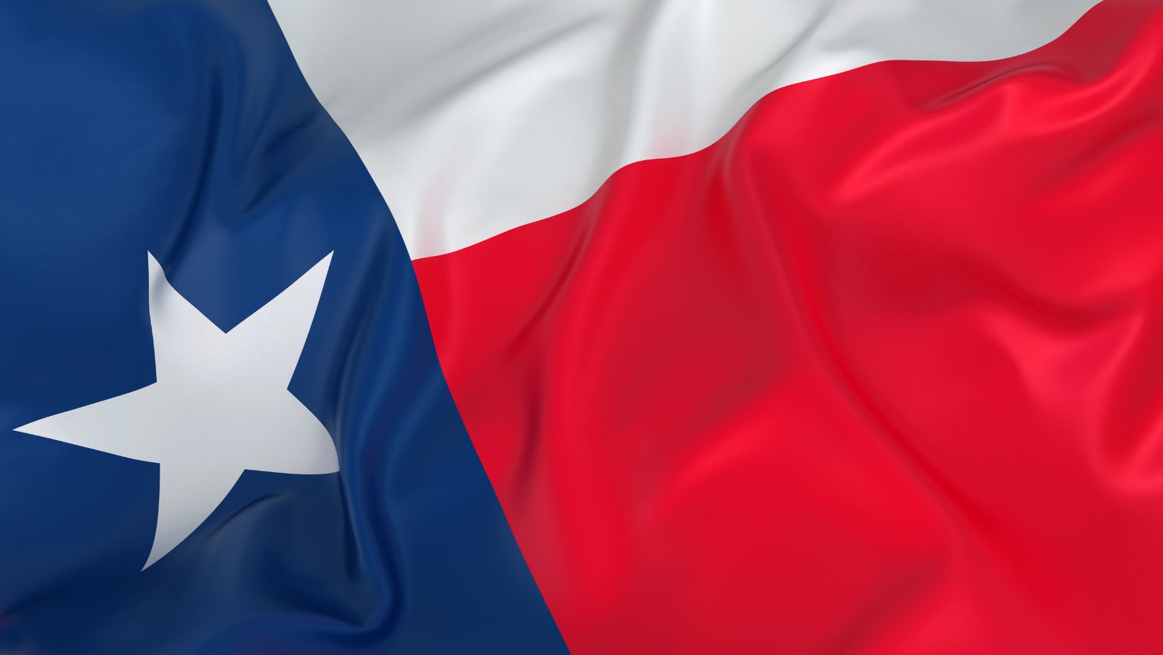
Linked to the Sheriff and a badge to prove he was in charge of law and order, this symbol stands the team well. It’s instantly authoritative and gives a good impression of the team’s mentality and goals from the outset: They are here to win.
It’s also very simple. Over the years, it’s been tweaked. The blue and white logo we know today was modified in the 1960s, giving it a more classic look and feel. It’s timeless, and it looks like it won’t be going anywhere anytime soon. To this day, it remains one of the best logos in the NFL.
Changes Over Time
While the Dallas Cowboys have a timeless classic as their logo, the baseball team, the Texas Rangers, was not so lucky. Beginning in the 1970s as a rather garish logo with a ten-gallon hat and a giant named slogan, the logo for this popular MLB team has softened over the years.
Yes, it’s gone through a number of iterations, including even becoming the shape of the state with a baseball inside it. And, at one point from 1994 to 2002, the logo was a star in a blue diamond. Now, though, it’s been reduced to a simpler form.
While it may not be as pretty, or as iconic as the star for the Dallas Cowboys, it’s at least recognisable without being over the top. A simple circle of blue and red, the name of the team, fits around a large baseball with the letter T in the middle. It’s simple and elegant and instantly tells everyone that this is a baseball team from Texas. And in that respect, it does the job perfectly.
It’s a Moo-point
Finally, there are a number of smaller teams that have opted to use iconic images from Texan culture. Take the longhorn cow, for instance. Both the Houston Texans (football) and FC Dallas (soccer) use a longhorn in their logos to great effect. But are these better?
This is really down to personal preference. But what can be said here is that all of them remind their fans of Texas, and all stick with red, blue, and white for the US.