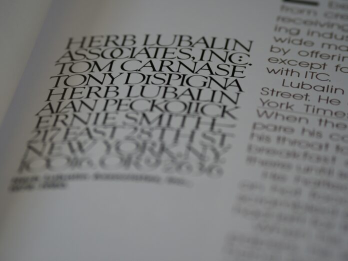
Typography isn’t just a detail—it’s the voice of your design. Whether you’re working on a branding package, a website UI, or a client’s event invitation, your font choices set the tone, create atmosphere, and guide user experience. With so many options out there—including a vast selection of free fonts—the abundance can be overwhelming, even for seasoned designers. This guide explores the key considerations and practical steps for selecting fonts that elevate your project’s intent, clarity, and aesthetic appeal.
1. Understand the Message and Mood
Every design has a message, and every font carries its own personality. Before even glancing at type specimens, clarify what your project needs to communicate. Is it formal or playful, modern or vintage, corporate or artistic? The way you answer these questions will help filter your font choices and ensure coherence.
For example, a law firm’s website demands a typeface that conveys trust and stability—think classic serifs or restrained sans-serifs. On the other hand, a kids’ party invitation benefits from whimsical, rounded fonts that evoke joy and excitement. As designer from Creative Fabrica Anas Hassan says, “Typography is the silent ambassador of your brand’s values; the right font whispers the right story before a single word is read.” Always let the content and context dictate your typography, not just personal taste or trendiness.
Mood boards can be immensely helpful. Collect imagery, color palettes, and type samples that express the feelings you want to evoke. This step is especially valuable when presenting font options to clients who might not have a “designer’s eye” but will instinctively react to the vibe of your selections.
2. Prioritize Readability and Legibility
It’s tempting to use an ornate or unconventional font to stand out, but legibility must always come first. Designers are responsible for ensuring users can quickly and comfortably read the text, whether it’s a single word on a logo or a dense block of body copy.
Consider where and how your font will appear. For large headlines, you can afford more decorative choices, while body text should be set in a simple, highly legible typeface. Pay attention to letter spacing (tracking), line height (leading), and font weight—these attributes can transform a mediocre choice into a polished result, or vice versa. Always test your selections in realistic contexts: print out a sample, view it on mobile, and check at different sizes.
Free resources let you experiment with a wide variety of styles before committing. Use mockups or wireframes to compare font options side by side, and get feedback from team members or users if possible.
3. Match Font Pairings With Purpose
Most projects require more than one font—typically, one for headlines and one for body copy. But font pairing is an art form in itself. The goal is to create visual hierarchy and harmony without causing discord or distraction.
Stick to a maximum of two or three typefaces per project, and make sure their personalities complement each other. A bold, geometric sans-serif pairs beautifully with a subtle, classic serif, creating a modern yet timeless feel. If you’re less experienced, try starting with fonts from the same superfamily (like Roboto and Roboto Slab), or use pre-made font pairing guides available online.
When in doubt, contrast is your friend. Pair a script font with a structured sans-serif, or a condensed headline font with a more spacious body type. Just be wary of fonts that are too similar; subtle differences can feel like mistakes rather than intentional design choices. Regularly review your typography as the design evolves, and don’t be afraid to switch it up if the project’s direction changes.
4. Consider Licensing and Versatility
It’s crucial to ensure the fonts you select are legally cleared for your intended use, whether that’s for print, web, or commercial applications. Many designers fall in love with a font, only to discover it’s cost-prohibitive or restricted in usage. Always check the license details—especially for client work.
Thankfully, there are reliable sources of quality, license-friendly typefaces. For experimentation or budget projects, collections with free fonts offer an extensive range of styles, often with commercial-use options. Keeping a toolkit of trusted sources lets you design confidently and efficiently.
Versatility matters too. Look for fonts with a broad range of weights and styles (italic, bold, light, etc.), as these give you the flexibility to build cohesive layouts without needing to introduce too many new typefaces.
5. Test, Refine, and Document Your Choices
Font selection isn’t a one-and-done decision. Once you have your short list, test your choices within real design contexts. Mock up a few pages, create alternative compositions, and see how the fonts perform under different lighting, screen sizes, or print conditions.
Invite feedback from peers or clients. Sometimes a font that looks great on your high-resolution monitor might not translate well to other environments. Make refinements as needed—adjust sizing, tracking, or even swap out a font entirely if it doesn’t serve the overall design.
Finally, document your font choices and usage guidelines, especially for brand or web projects. Clear documentation ensures consistency across teams and future projects, saving time and reducing errors down the line.
Conclusion
Choosing the perfect font for your project is about balancing creativity with strategy. By understanding your message, prioritizing readability, curating effective pairings, respecting licensing, and rigorously testing your selections, you empower your design to connect and communicate effectively. Fonts are more than letters—they’re the first impression your design makes. Choose them with the same care you give to every other creative detail.


