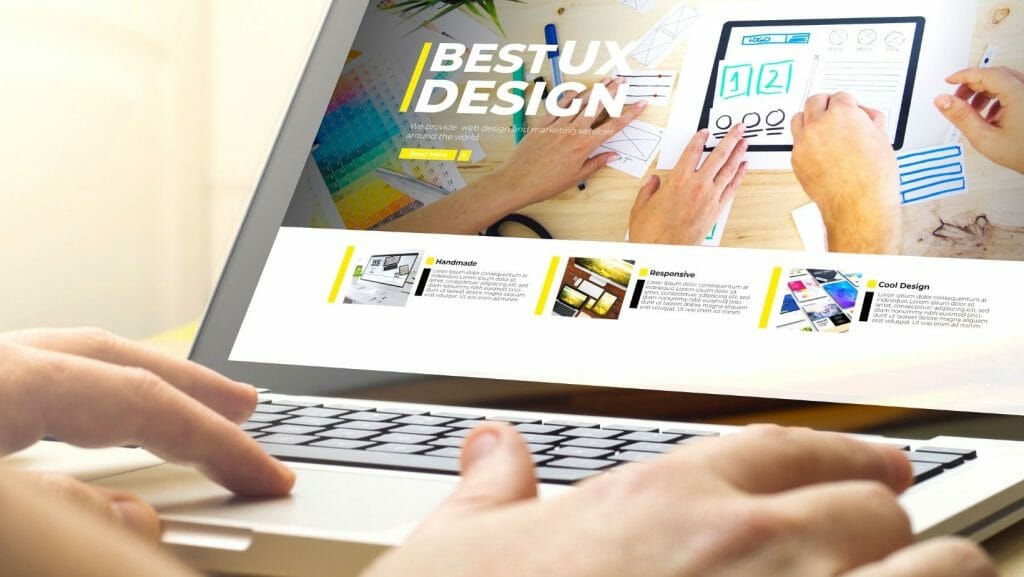
Are you familiar with UX design? Want to know how it affects search engine optimization?
UX design determines the engagement and following that your website and company will receive. It will also affect your rankings and where your website may be listed when people Google a topic. UX design is very important in terms of making sure viewers see your website and products.
Using an SEO friendly layout
The top way that UX design affects your SEO levels is the layout. A user experience design agency could help you determine the best layouts and what your company could benefit from the most. Layout design and content can affect how people read your website. While the content is very important as well, people will notice the layout before they even begin reading.
You want your layout to look simple and inviting to encourage people to keep reading. Make sure your layout is built to generate traffic, and your website is easy to use and find topics.
Here are some best practices you can follow when designing UX for SEO:

Use images and videos
Images and videos should be brought in and put throughout the article. Don’t put them all at the beginning of the end. Make sure they are also relevant to the topic and now just randomly thrown in.
Most UX design professionals recommend using a video or image for each block of content. Visuals will also keep readers engaged and allow them to skim the material easier.

Linking is key
Any good article will include links to websites and other content that back up your material. It’s also an easy way to show that your content is reputable and researched. They also allow the user to navigate around the website, which increases SEO.
Links can be placed anywhere in the article, but as the images, they should also be relevant. Try not to throw in links that will take the reader to a page that doesn’t involve what they are trying to learn more about.

Use CTAs whenever possible
CTAs are also linking but work a little differently. CTAs should be specific to make someone want to buy or use something that your company has. They also keep the reader on your site longer and allow them to learn more.
Similar to linking, make sure the CTA is also helpful and not random. The CTA should advertise or sell the product or goal you are discussing. It should also lead them to the action you want them to take. Your CTA should evoke emotions and use strong verbs for a better result.
Ensure that the CTA link is always working properly. Feel free to include more than one or several in one article.

Make the content easy to skim
Even though we want people to read our entire article, most people do not. If they can’t skim the material or find the material they are searching for, they will most likely move on and look for the information on another website.
Use bullets or charts when possible to try and break up content. You should also break up the content by headers in larger letters. This way, people can easily find the section they want without reading everything.

Headers and more headers
Headers are the easiest way to format. Sub-headers are even better at further separating information. Usually, the only H1 tag will be the title, followed by H2, and H3. You can never have too many subheaders.
For readability, break up paragraphs into smaller sentences and only use a few lines per paragraph. This makes the content appear better on mobile devices and is another way you can make sure the copy is able to be skimmed.


