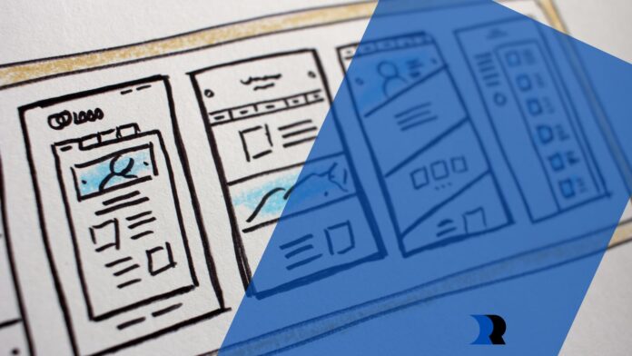
With the majority of users accessing websites from mobile devices, optimizing for smaller screens is no longer a luxury but a necessity. But it doesn’t mean you’re simply going to make a “mobile version” of a site. This is where the power of responsive web design shines—it enables you to design a single website that automatically adjusts itself to fit any screen.
How to Develop a Mobile-Responsive Website
Designing a mobile-responsive website is more than just shrinking your desktop website to fit a smaller screen.
As of 2023, here are five best practices for creating a mobile-responsive web design for contractors.
Prioritize Speed and Performance
A one-second delay in loading time can result in a loss in conversions. That’s why prioritizing speed and performance is not just an optional design feature but a necessity for any website aiming to provide a satisfactory user experience.
Use compressed images and scalable vector graphics (SVGs) where possible to reduce load time. Apply minified CSS and JavaScript to lessen the amount of code that needs to be loaded. You can also use lazy loading for images and other media files. This way, they only load when they’re about to be displayed.
Create a User-Focused Design
Mobile users are generally in a hurry and need information fast. Design with the user in mind by making navigation easy, text readable, and call-to-action buttons accessible.

Ensure that text is readable without zooming. Use a simplified menu, a well-structured layout, and clear call-to-actions (CTAs) that are easy to tap. You want to go for a design made for thumb navigation, as most users hold their mobile devices in one hand.
Test Across Multiple Devices and Browsers
Users access websites from various devices—smartphones, tablets, laptops, and desktops—all of which come in various screen sizes and resolutions. Remember, each user might prefer a different browser. That’s why testing your website across multiple devices and browsers is not just advisable but a must.
While Chrome, Firefox, and Safari cover a significant share of the market, don’t forget about other browsers. Consider what’s popular in your target market.
Updates to browsers and the release of new devices mean you should regularly perform these tests to maintain compatibility.
Opt for a Fluid Grid Layout
Traditional fixed-width layouts were designed with desktop screens in mind, with consistent and predictable dimensions. However, the various mobile devices available today have vastly different screen sizes and resolutions. It made fixed-width layouts impractical for modern web design. That’s where fluid grid layouts come in handy.
A fluid grid layout uses percentages and proportional measurements instead of fixed pixels to define the width and height of various elements on the webpage. This adaptability ensures that your website’s layout will scale seamlessly when accessed using different devices. Also, implement media queries to adjust the design and layout based on different device capabilities.
Leverage Accelerated Mobile Pages (AMP)
AMP can significantly speed up load time for mobile users. It eliminates many elements that cause web pages to load slowly.

It’s also good for search engine optimization by boosting your search rankings, as browsers often favor AMP-enabled pages.
Key Takeaways
These best practices are your roadmap to building a site that looks good and performs exceptionally well on mobile devices.
- Prioritize speed to keep users on your website.
- Design with user experience in mind by making the site navigable.
- Test across different devices to provide a consistent and uniform user experience.
- Adaptability across various screen sizes will make your site more accessible.
- Quick page loads via AMP-enabled sites are a major factor in user satisfaction and SEO.


